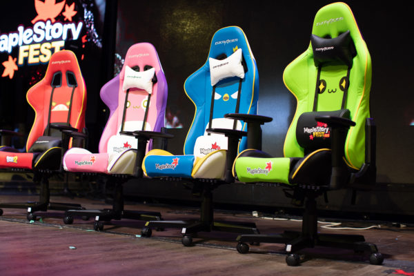
MapleStory Fest started in back in April 14th 2-18. It was something that would come up in brainstorming sessions often. I would always back anyone that through the idea onto the ring. Eventually the idea got enough attention for it to happen. We had 3 different version of Maplestory we had been working on for the past year. Maplestory M and Maplestory 2 were set to launch later that year so it felt like it was the best time to rally our most hardcore fans and treat them to a community gathering. The second the creative team started getting official request I dived in. I din’t really know what I was getting my self into.  It was one of the most intense back and forth projects I had dealt with in my professional career. There were so many people involved in overseeing the design process. Not just in the states but also in our Korean offices as well. At one point I had over 20 different options. 

Coming up with the Branding logo

After several revisions and after collecting feedback from all the teams I came to a realization. I really wanted to create something that would be marry all of our games logos in a way that was respectful and creative. I think in the end the final logo I presented resonated the most. There’s a lot of symbolism and hidden detailes in the design. For example the 3 leaves represent our MapleStory games.  The two top ones represent the desktop games and the other lead is our mobile version next to the word fest. The smaller leaf at the top represented the community that had started growing in the west while the small one had the signature Maplestory M orange. There’s also a few other details meant as thoughtful reminders that the design was meant to tie all the games into one event. At one point I sent a concept sketch of the branding logo to different stake holders to show them all the different ways this logo was a good option for the event. Once I had sent that everyone could see that this was the one meant represent the festival. One of the most rewarding things about having been part of the project and the event itself was getting to meet and work with so many people from team across different offices. Seeing ones work in so many was also incredible. I felt so proud and honored that I had the opportunity to create the branding logo for an event that was so special. 

Previous versions submitted for review.

That logo on the bottom left sparked discussion of using it as a design for a possible sales item meant as a commemorative pin. Which in turn lead to people wanting to set up a pop up shop. It’s amazing how ideas just snowballed once people got inspired. At the 2018 fest I was at the archer both giving away mugs to anyone that could hit a target. I also made a Maplestory Anniversary bow for those who wanted to take pictures while they tried their aim. During the 2019 event I was with the mascot team and ran around as one of our most popular monsters “Slime”. I posted about the 2019 fest here.  Here’s a few pictures of from the 2018 and 2019 festivals: 

Event video recaps